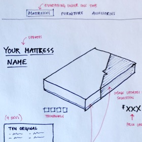
Tuft & Needle’s customer experience (CX) team uses a bespoke app for their customer relationship and order management system. The app, built in-house by software engineers alone, had never benefited from a UX design process. My job was to quickly identify and create solutions to improve the system and better support our CX team.
A painful status quo
We called this project CX Tex-Mex (CXTXMX) because we wanted to bring delight and ease to our CX team, primarily based in the southwest. Our project team consisted of a full-stack software engineer, a customer experience team member, and me, our UX designer.
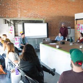
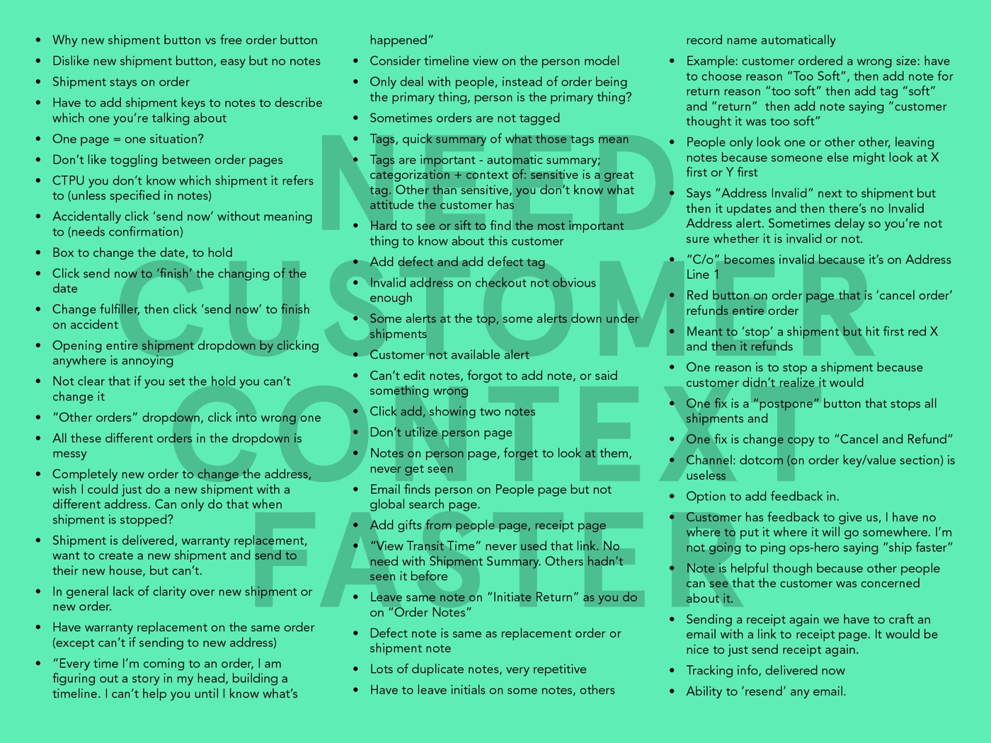
I started the project off with an intensive research week of shadowing and interviewing CXers. I was shocked at the amount of redundancy and friction in their process. Most of the time on each support ticket was spent trying to get context on the customer’s situation and any previous actions taken by the team. They were using upwards of six different webpages and apps to resolve even the simplest issues. The complexity increased drastically when the customer had more than one order, or multiple contacts were needed to fix a problem.
Diverge, converge, go.
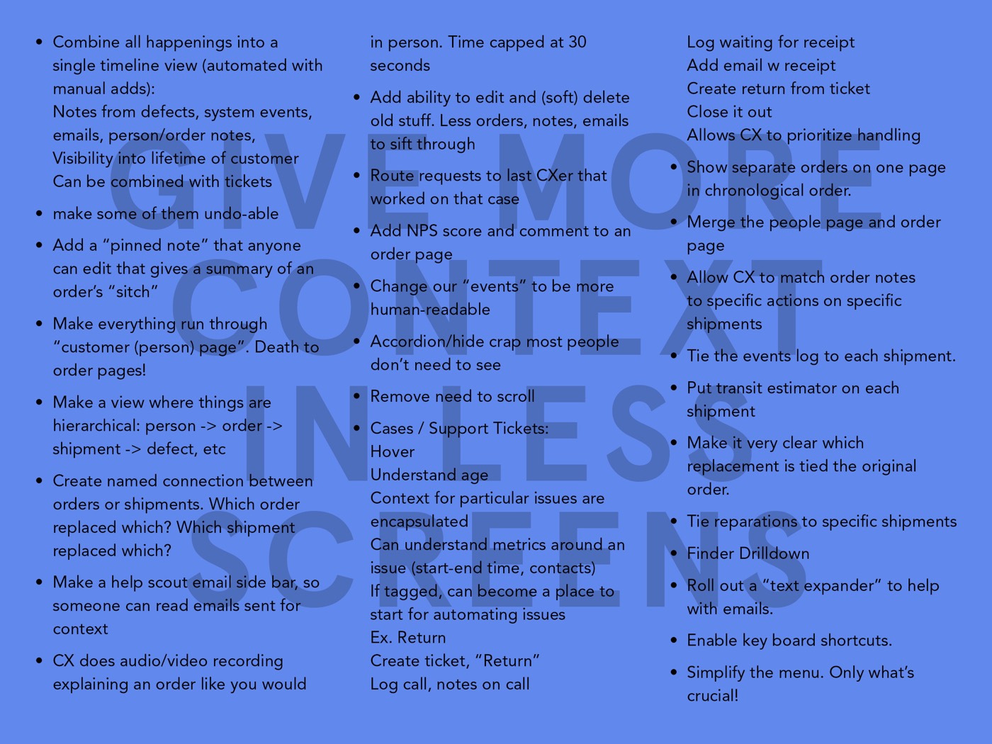
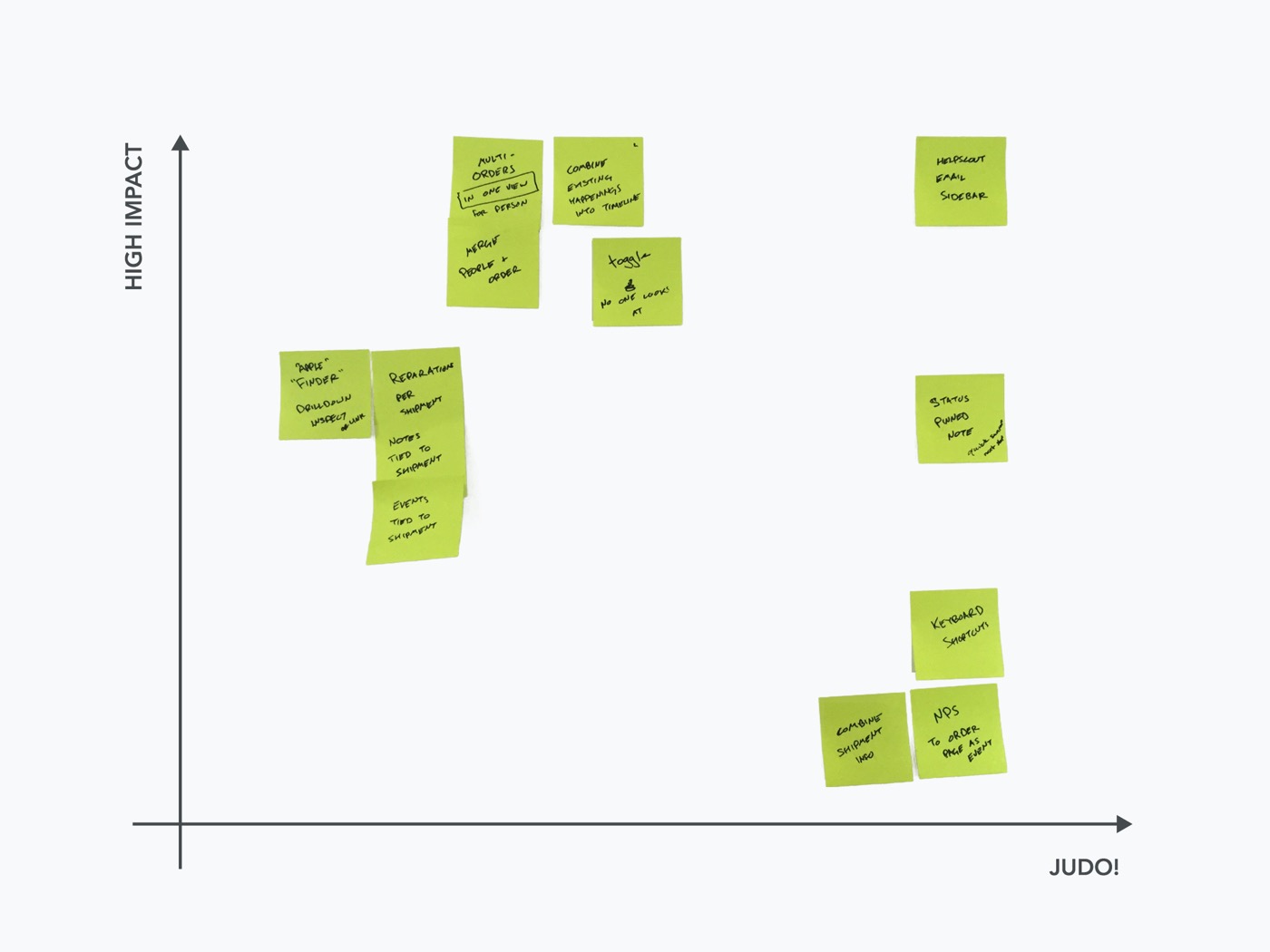
Once I downloaded the findings to our CXTXMX project team, I facilitated a 2-day ideation session, which generated more than 30 feasible ideas for improvement. We then mapped these items to an Eisenhower matrix to identify the most significant wins achievable in four 1-week sprints. Each week, we paired to design, build, and launch one new feature.
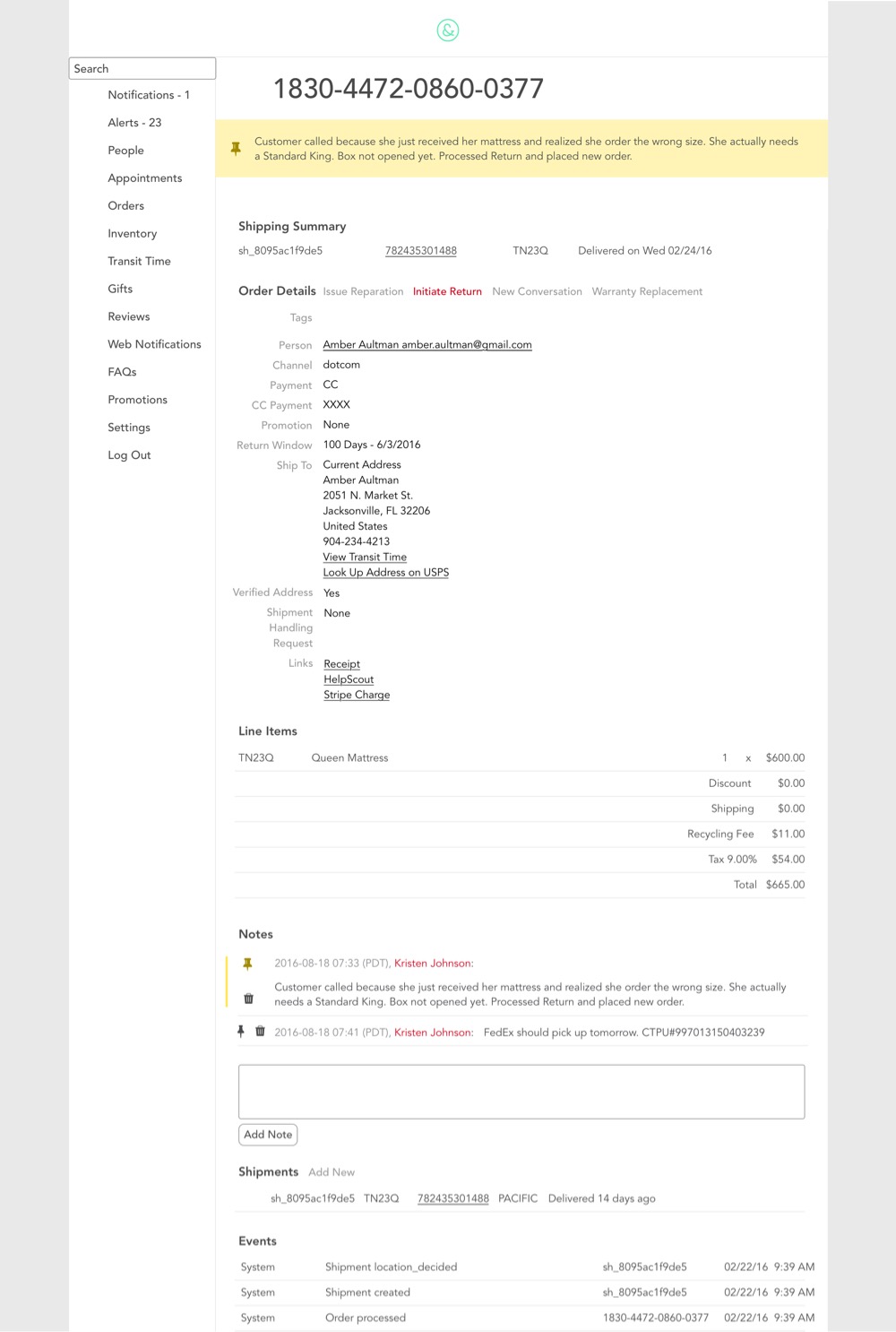
Pinned notes on the order page
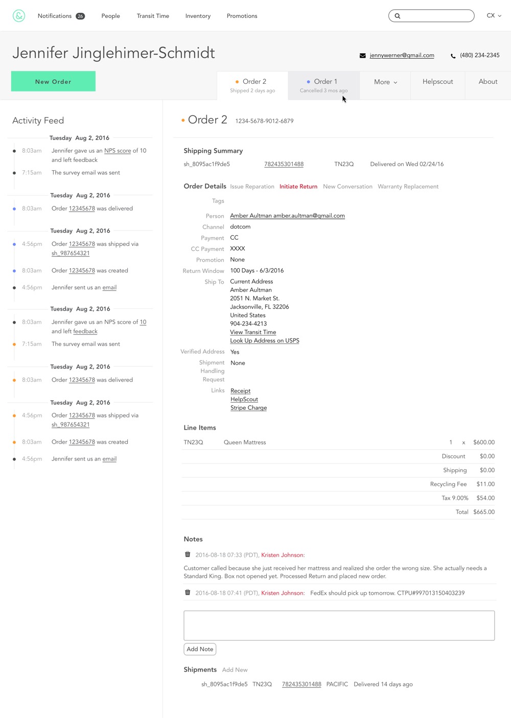
Adding the ability to pin a single note to the top of the order page allowed users to get instant context on each order. Pinned notes also ensured that CXers didn’t miss essential information or waste time going down the wrong path.
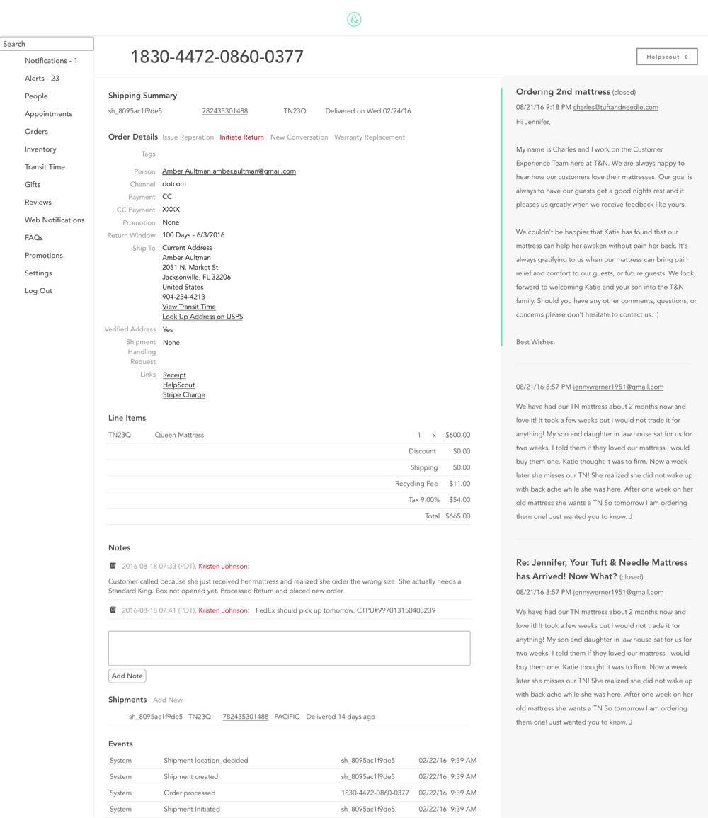
Helpscout email drawer on the order page
By pulling any related email conversations into a drawer on the order page, we saved CXers from having to bounce back and forth between the admin app and Helpscout, our CX email management tool. On one screen, they were able to see the order details and track the conversation.
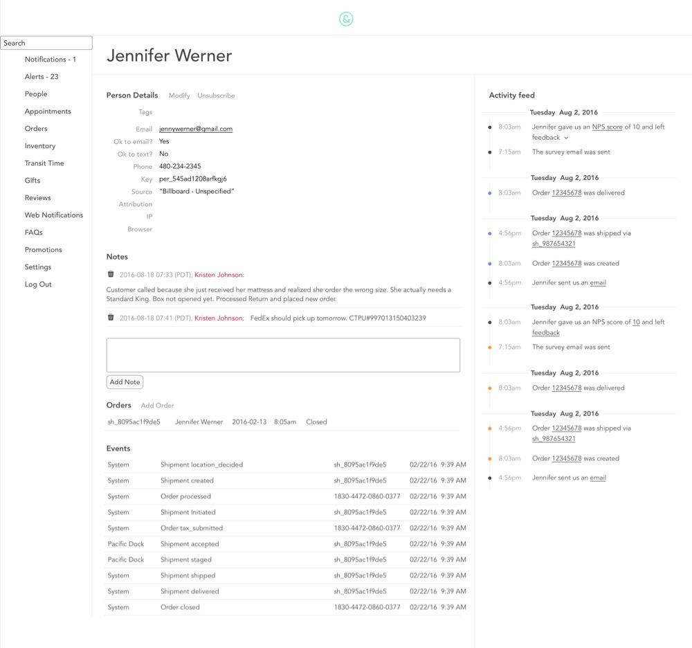
Activity feed on the person page
To provide context for even the most complicated order histories, we created an activity feed on the person page. This section tracked all history, interactions, and status changes for the customer in a clickable color-coded timeline.
Targeted navigation
When we started, the admin app had 15 top-level navigation elements! Most CXers only used 2-5 items in a day. People in different roles used the remaining navigational elements. The massive navigation was especially challenging for new CXers trying to learn the system. In response, we created a context switcher, a global dropdown which grouped navigational elements by role. The new context-switcher nav allowed users to focus only on the links relevant to their current tasks.
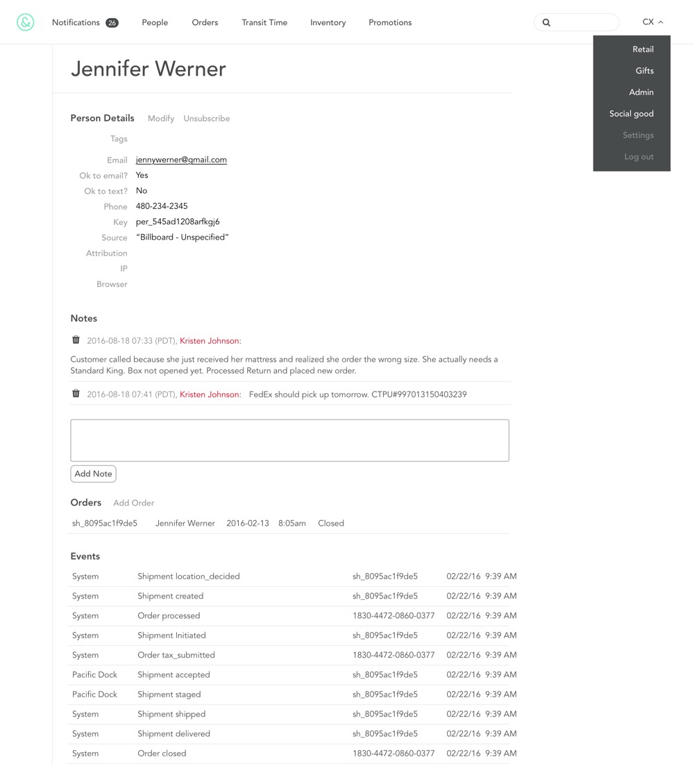
User testing confirmed the need for further improvements.
Once we completed the sprints, I began testing the new features with our CX team while our software engineer cleaned up tech debt. In user testing, my suspicions were confirmed that while these improvements were increasing efficiency, some broader architecture still needed resolving. And so, we decided to tackle one more feature: merging the people and order pages.
A combined order/person view
By combining the order and person pages into one tabbed view, we brought all the new features together under one roof. This integrated view gave CXers even more context around order history and minimized clicks. Figuring out spacing and hierarchy was definitely a challenge. Luckily, the app was only ever used on desktop, so that simplified things significantly.
The features designed, built, and released during CXTXMX decreased CXers frustration around gaining customer context across multiple views and apps and ultimately increased task efficiency by 18%. But the best part for me was being able to show some design love to the people who take fantastic care of our customers every day. CXTXMX made them feel valued and heard. They were thrilled to be a priority, and they were fascinated by our process.
Here are a few bits of feedback we received from the CX team:
"I’ve only been using the Helpscout sidebar for 1 hour while doing alerts and it has already proven to be the best thing ever. Saves SO much time!" -Kristen
"I came across a pinned note and was able to quickly resolve the issue without having to spend a ton of time reading through the notes" - Jamie
"When a customer says they didn’t get an automated email, it's really easy to go back and see exactly when the email was sent." - Cassie
Thank Yous
Jimmy Le Thai Full Stack Development
Ray Rita Customer Experience Lead
Jeff Wells Stakeholder & Strategy

