After five years of working fast and bootstrapped, the Tuft & Needle brand had become splintered across its various channels. The company had also grown beyond its early startup mentality and audience. We needed a refresh that would better attract new customers and align with the company’s evolved ethos.
Building personas from research and analytics data
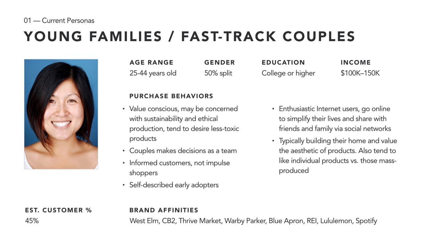
In 2017, we began a research project to understand our customers and categorize them into persona groups. The team conducted 20 in-depth interviews with our customers and cross-referenced findings with quantitative data from Google Analytics and Facebook. Four persona groups emerged: Practical Shoppers, Fast Track Couples/Young Families, Empty Nesters, and Sensory Shoppers.
Determining the workshop structure
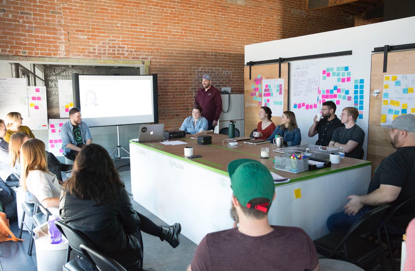
My colleague and I worked closely to develop an agenda that would educate participants on human-centered design, allow multidisciplinary thought to flourish, and create inspired yet actionable insights. We decided to break the ideation into two parts: a branding workshop and an ecommerce workshop, containing people from various disciplines.
Audience, audit, and the competitive landscape: the makings of a branding workshop
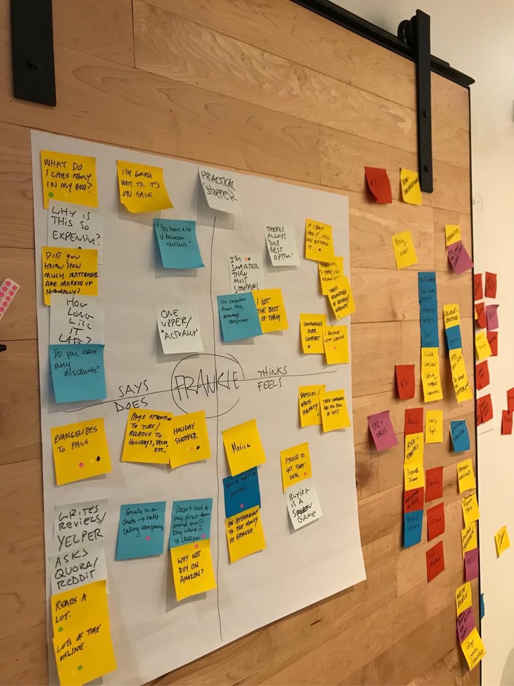
Aligning on our personas
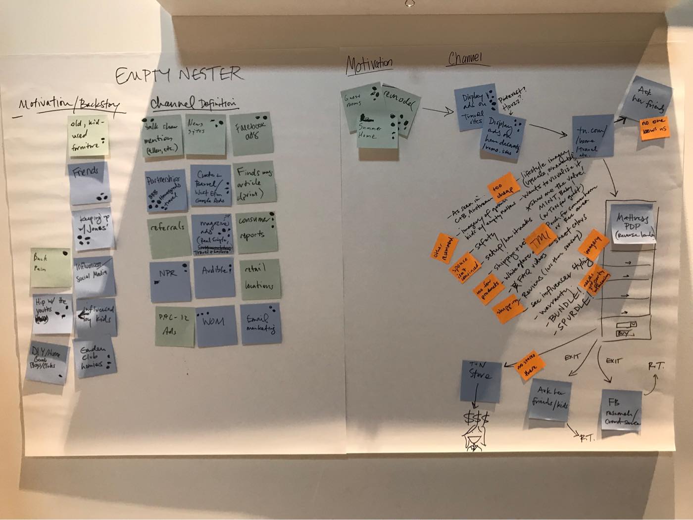
First, we focused on our audience. We shared the persona work and analytics data with the group. Using empathy mapping and other design thinking exercises, participants sought to put themselves in the mental “shoes” of each persona.
A comprehensive audit
To kick off the audit, we pulled samples from every instance of the brand and hung them on the wall. With sticky notes in hand, participants then analyzed the output for strengths, weaknesses, inconsistencies, and gaps.
Understanding the landscape
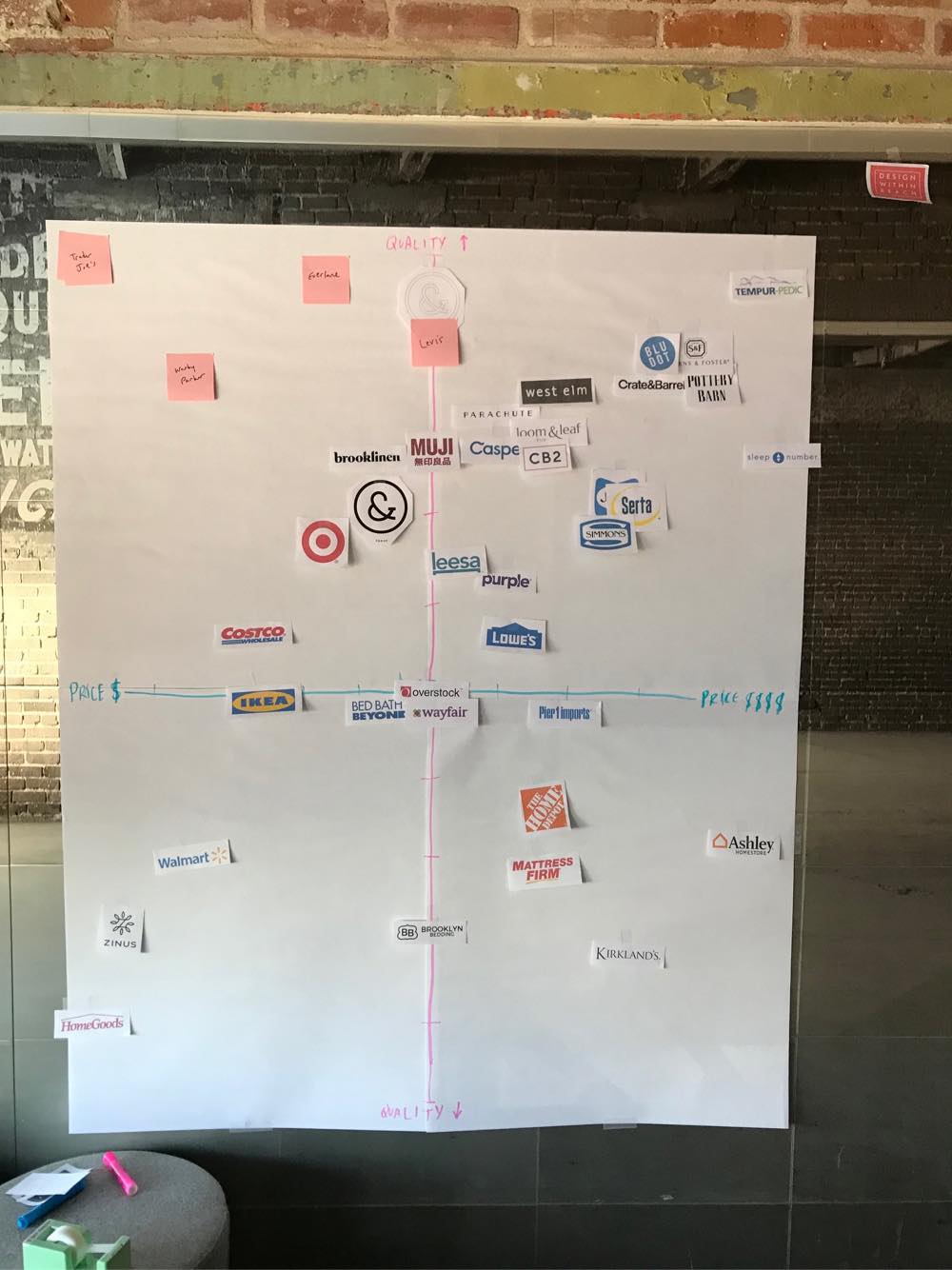
A brand map helped us identify where we sit amongst competitors regarding quality and price, two primary attributes for our brand. This exercise helped us better understand the competitive landscape and identify holes where we might gain an advantage.
Making it visual
Finally, we divided the group into teams and gave each one a large handful of typography, color, illustration, photography, and messaging samples. Each group created a mood board of the pieces that they felt would resonate with their persona. These mood boards established the starting point for the visual changes to the brand.
A digital workshop of journeys, debt, and how-might-we’s
We kicked off the digital workshop with a review of the audit. We then completed SWOT analyses for our main competitors and made a list of our design and tech debt.
Exploring customer journeys
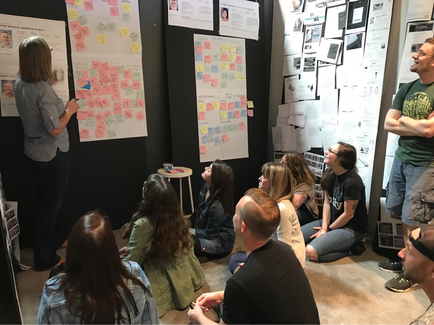
To identify potential journeys, each group ideated on their persona’s motivations for why they might want a new mattress. From these entry channels, the groups mapped out their personas’ journeys through our site. Finally, they identified issues and information gaps in the flows.
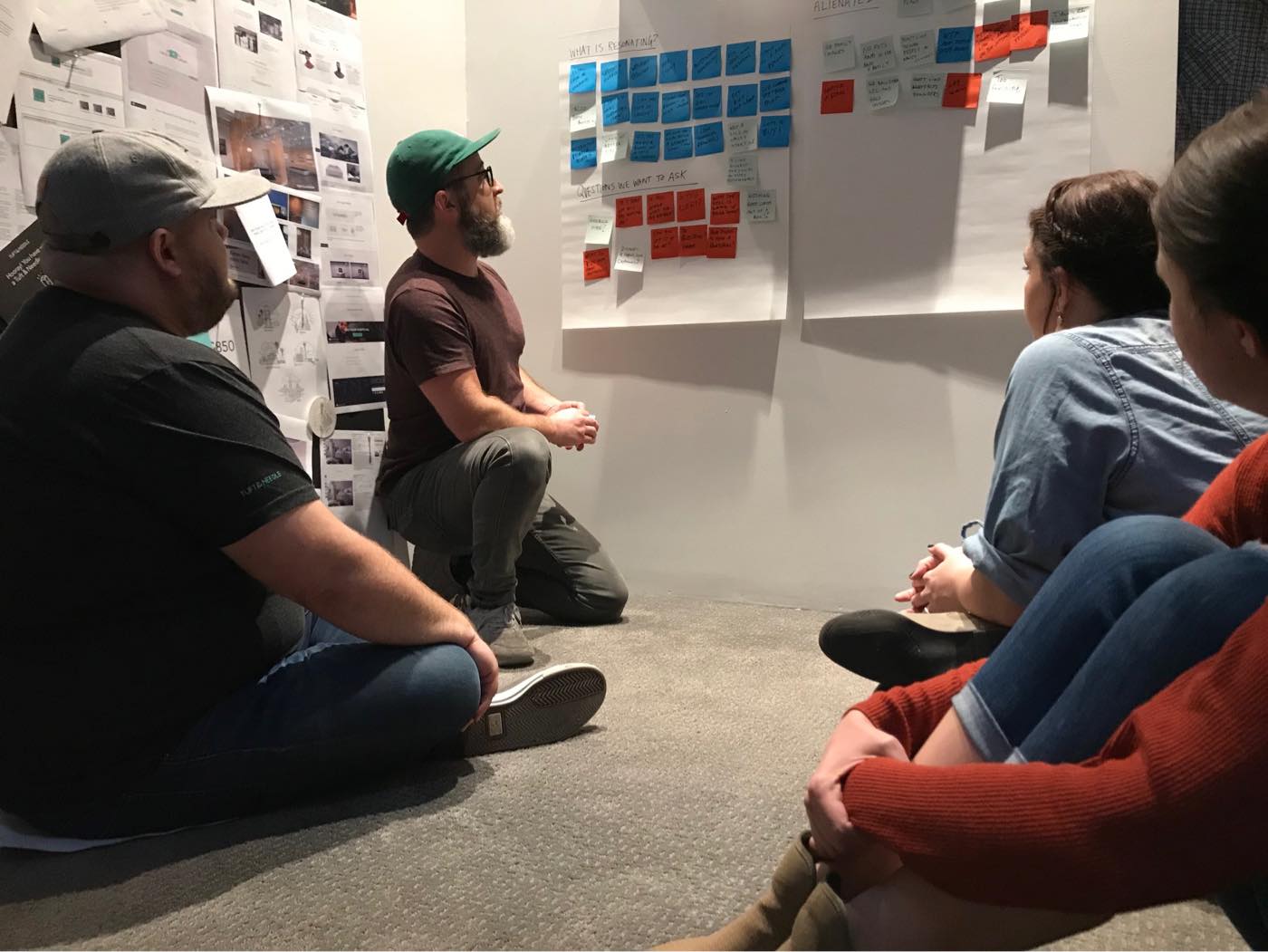
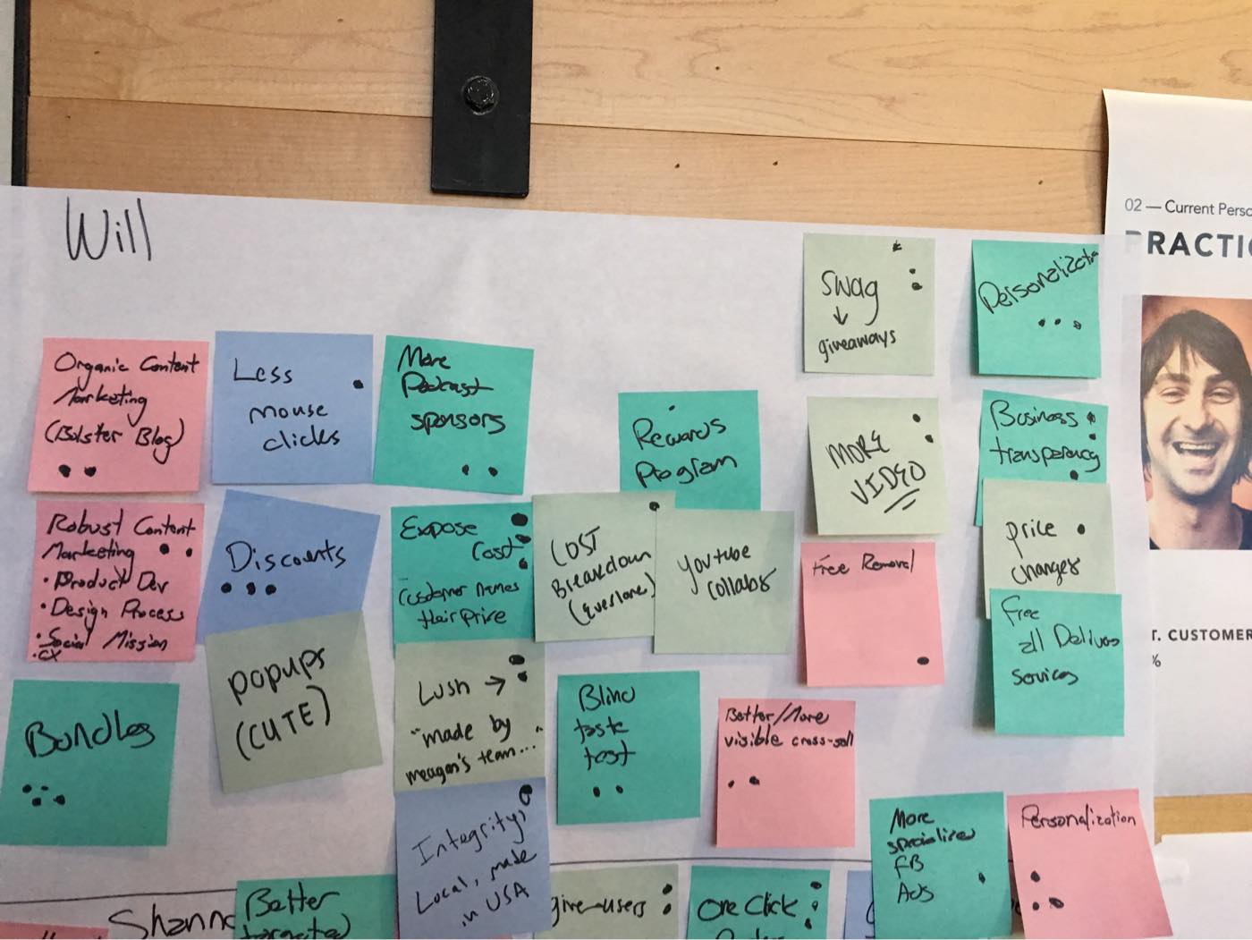
We then moved on to my favorite part: a “How Might We” (HMW) brainstorming session on what initiatives might differentiate us from competitors, increase sales, build brand love, and gain efficiencies for future iterations.
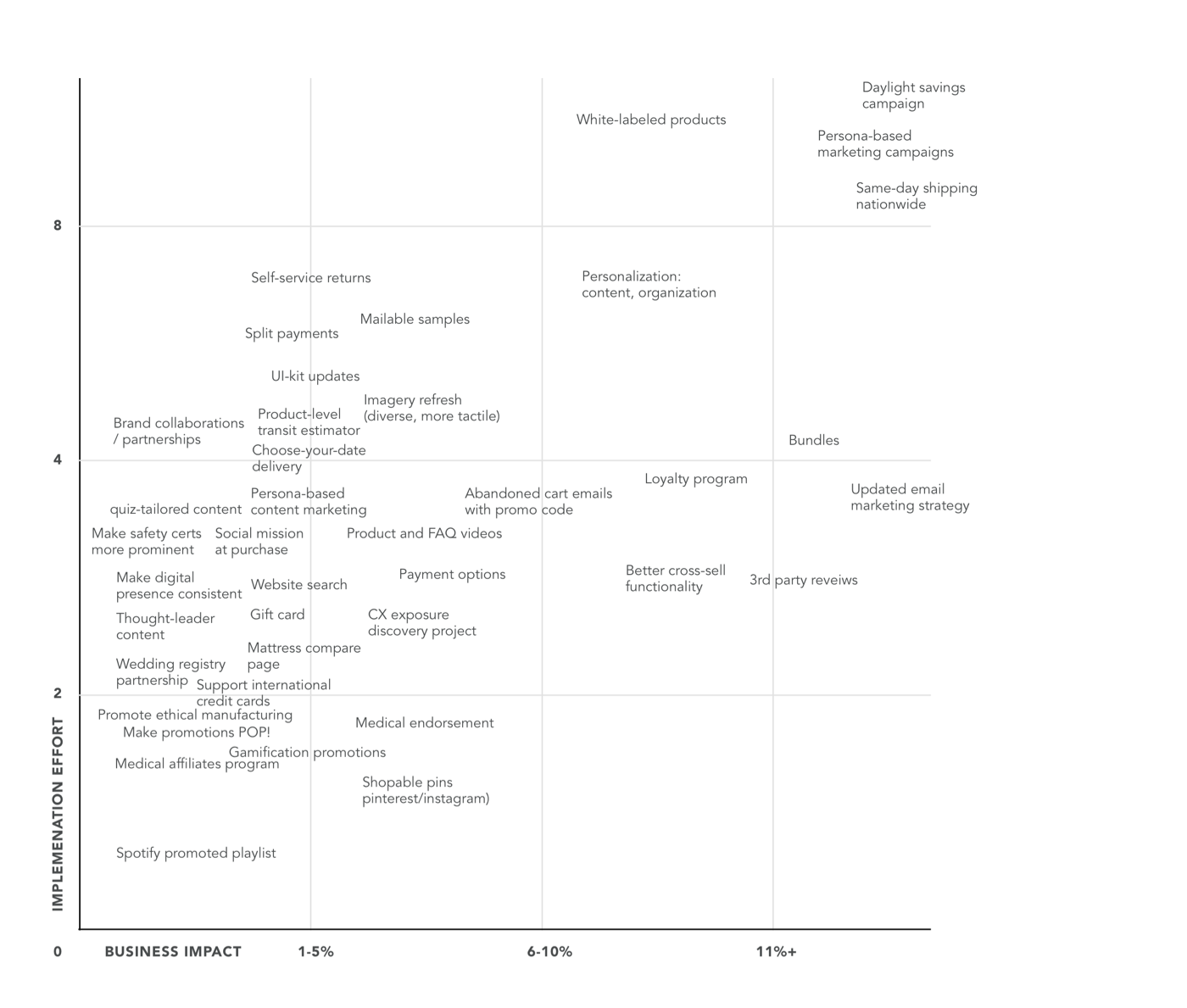
Prioritizing with an Eisenhower matrix
The last day of the digital workshop was spent evaluating the ideas. We mapped the final contenders on an Eisenhower matrix to identify which ones had the most potential. These were then roadmapped in the next quarterly planning session.
The next iteration of our brand emerges
Over the next six months, the team implemented these updates to the brand. While we decided not to touch the logo, the refresh included new typography, expansion of the color palette, a fresh photography style, and a more comprehensive UI library.
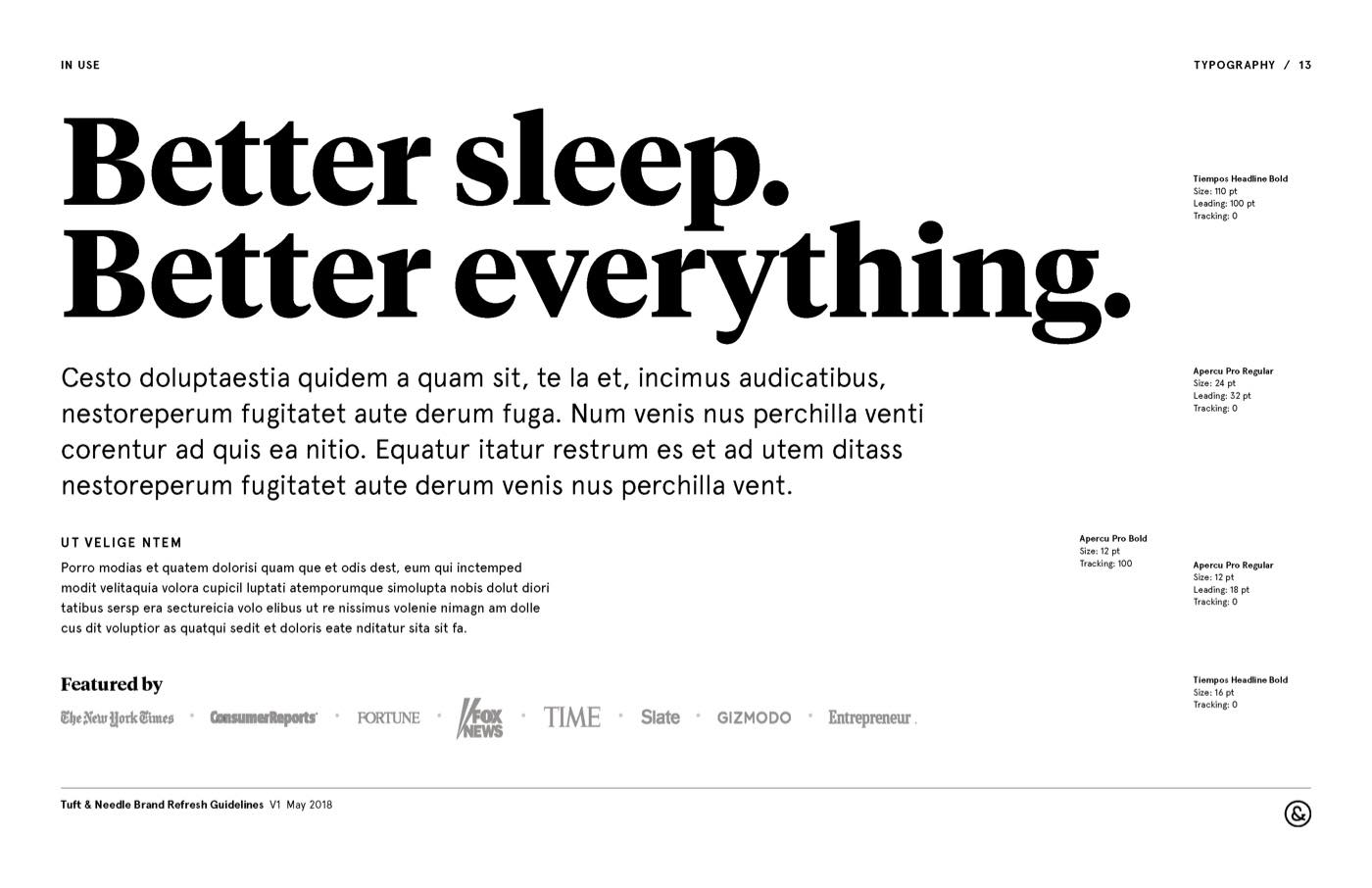
Typefaces with more personality
Before the rebrand, the Tuft & Needle typography consisted mostly of Avenir with a little Trade Gothic peppered in. While these faces are very legible workhorses, they lacked personality and approachability. We chose Tiempos and Apercu instead. Tiempos, used for main headlines, provided a refreshing friendliness to the brand. Apercu, while modern and versatile like Avenir, added humanness with its subtle curves.
An expanded color palette
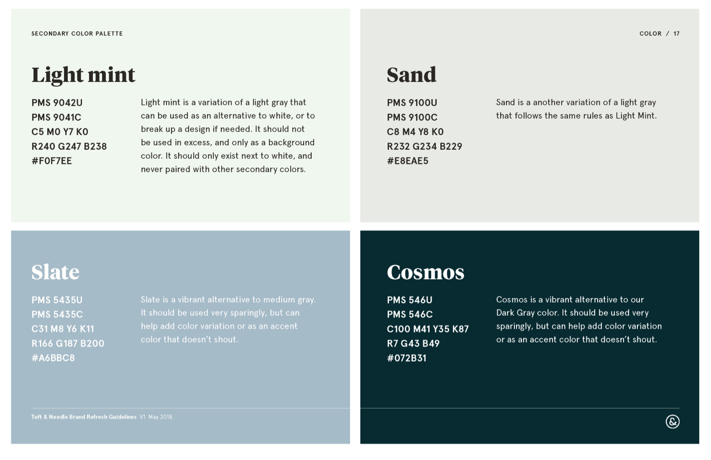
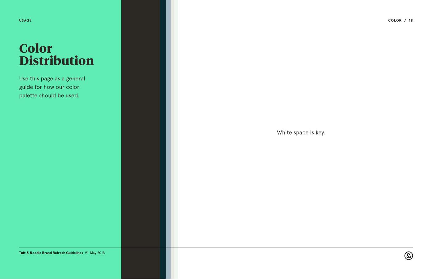
Tuft & Needle’s minimal color palette consisted of the T&N Mint and several shades of gray. By adding muted secondary colors, we helped warm and soften the brand, making it more appealing to our diverse audience.
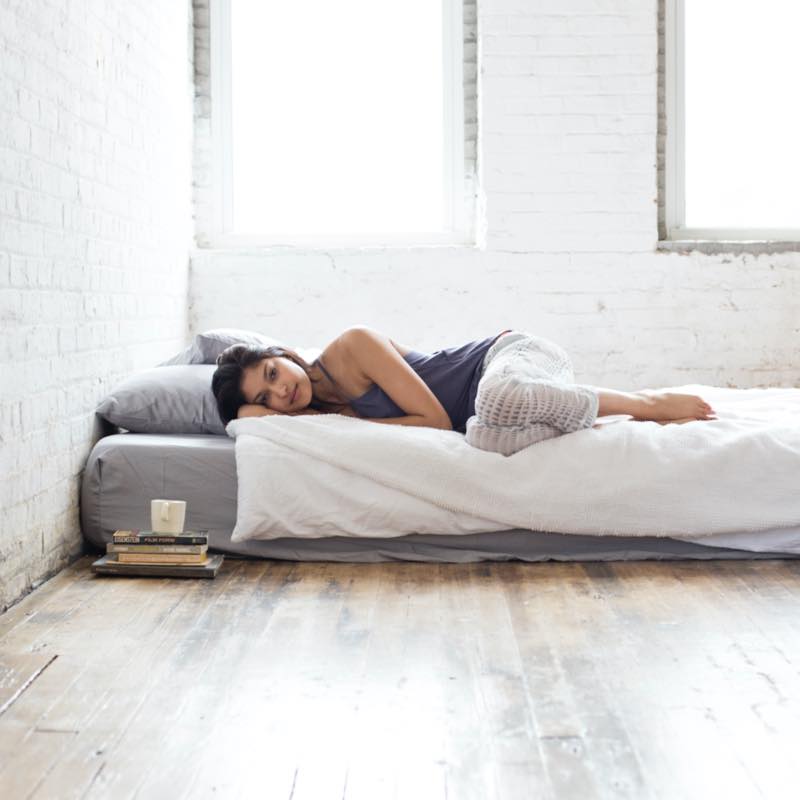
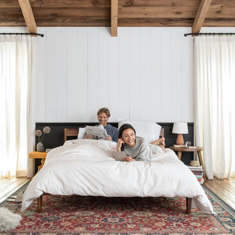
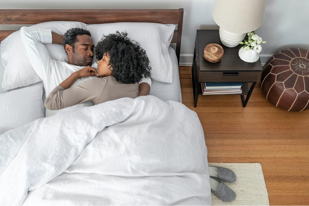
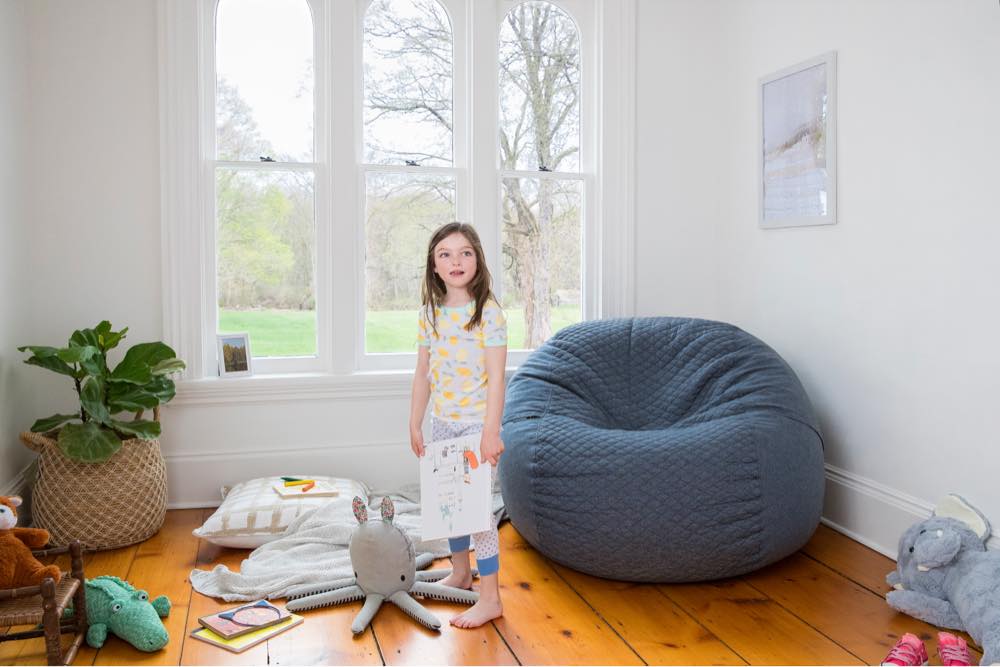
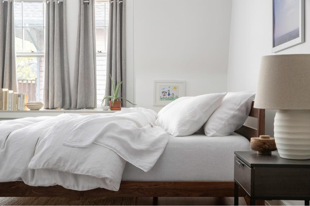
Photography that is aspirational yet approachable
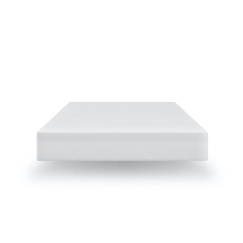
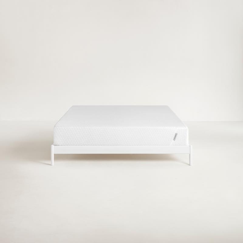
Above all, we wanted the new photography to feel real, lived-in, and comfortable. This meant choosing real home locations with lots of texture and architectural detail, better casting for on-camera chemistry, more candid talent direction, and triple washing all linens before the shoot to give them a natural, broken-in look. This approach was in stark contrast to T&N’s previous style, which focused on almost other-worldly perfection with floating drop shadows and texture dutifully photoshopped out.
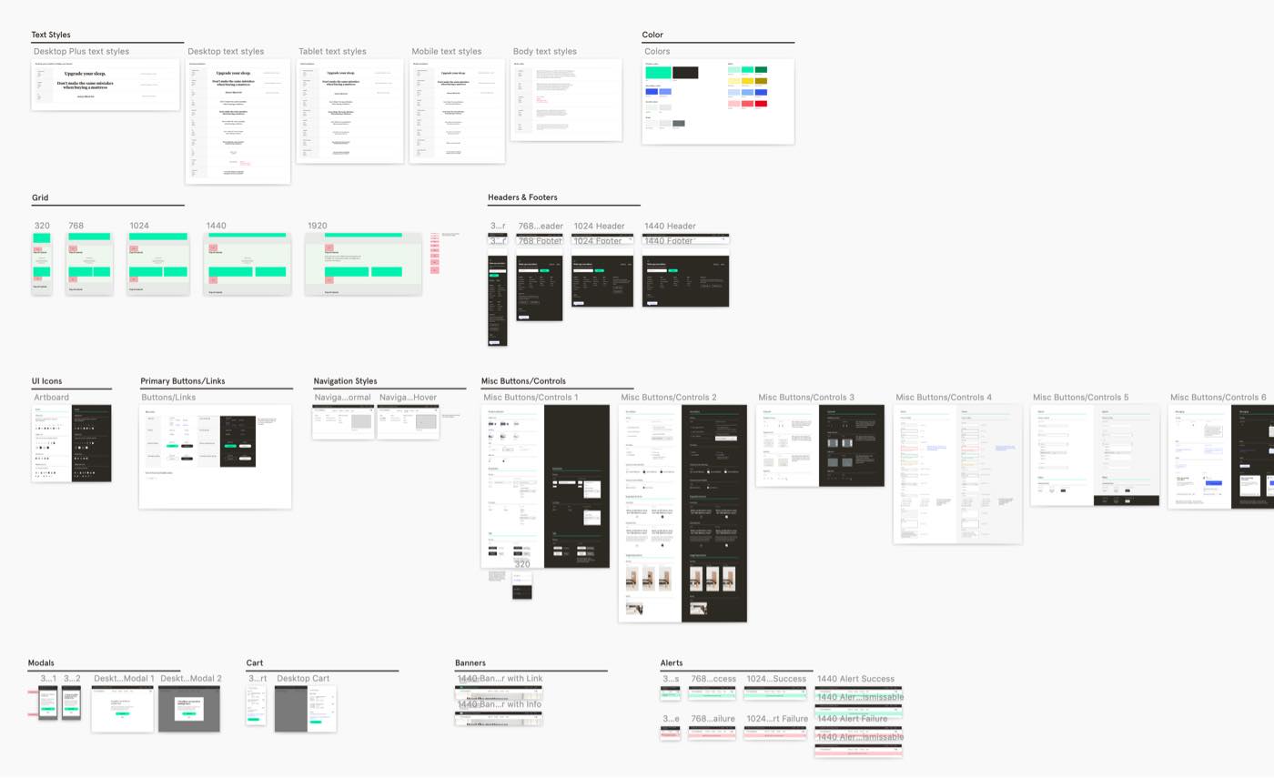
A new UI library and many customer-driven features deployed
The digital workshop updates took longer to roll out. We overhauled our UI library and launched several significant initiatives: third-party-validated reviews, cross-sell and product discovery, an updated email marketing strategy, easy-pay options, personalized content, several brand-building partnerships, and user accounts. There are still more projects waiting to be prioritized in 2020. Still, considering the enormity of the tasks and the other priorities that keep getting added, I’m thrilled with what the team has achieved.
Due to the rolling nature of the brand updates and many other initiatives happening at once, it’s hard to put firm numbers to the rebrand success. However, these changes contributed to a 55.6% increase in total organic social audience, a 380% increase in engagement, and a 289% increase in organic post link clicks across all our social media channels. We’ve also seen a 30.46% increase in site traffic and a 35.46% increase in page views.
Thank Yous
Sean Tucker Visual Design & Facilitation
Darin Barnes UI Kit Design
The Design Team
Workshop Prep & Participation,
UX & Visual Design
Breanne DeMore & Shelly Weaver
Workshop Prep & Participation,
Copywriting
Kyle Niemier & Geoff Parker Production & Photo Editing
Anna Wolf Photography