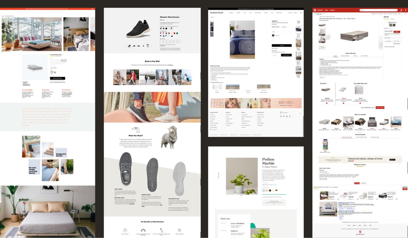
In our research, participants loved the unique, storytelling layouts of Tuft & Needle’s product detail pages (PDPs). They reported that large photography, custom iconography, and diagrams helped them make purchase decisions. However, given the product launch cadence, we needed to find a way to make these pages more efficient so that design and engineering could focus their efforts on more complex problems.
The team was given only three weeks to completely redesign a new flexible template system that would allow for quick launches yet maintain our current pages’ storytelling.
User testing confirms our hypotheses
User testing on the existing product pages confirmed what we knew: moving between products was confusing for customers. The pages lacked consistent patterns, making it hard to find information quickly and compare products. It also revealed how critical reviews are for shoppers. The large, engaging photography, iconography, and diagrams were helpful to participants. However, they also revealed some issues with how the diagrams were fitting in various viewports.
Getting everyone into the room and on the same page
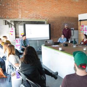
Both marketing and UX had many ideas about how the page should be structured. To make sure we took everything into account, we held an initial brainstorming session with marketing. We asked each participant (marketing, design, copywriters) to bring three examples of PDPs that they felt were successful and to be prepared to explain why. We then put them up on the walls to identify patterns. Talking through everyone’s selections, we made sure to capture any must-have requirements and hypotheses to test.
This initial meeting was a great way to ensure that marketing felt heard and that their requirements were factored in. Of course, there were areas where UX and marketing were in disagreement about the best course of action. We worked through each of these issues and noted any items that we wanted to A/B test.
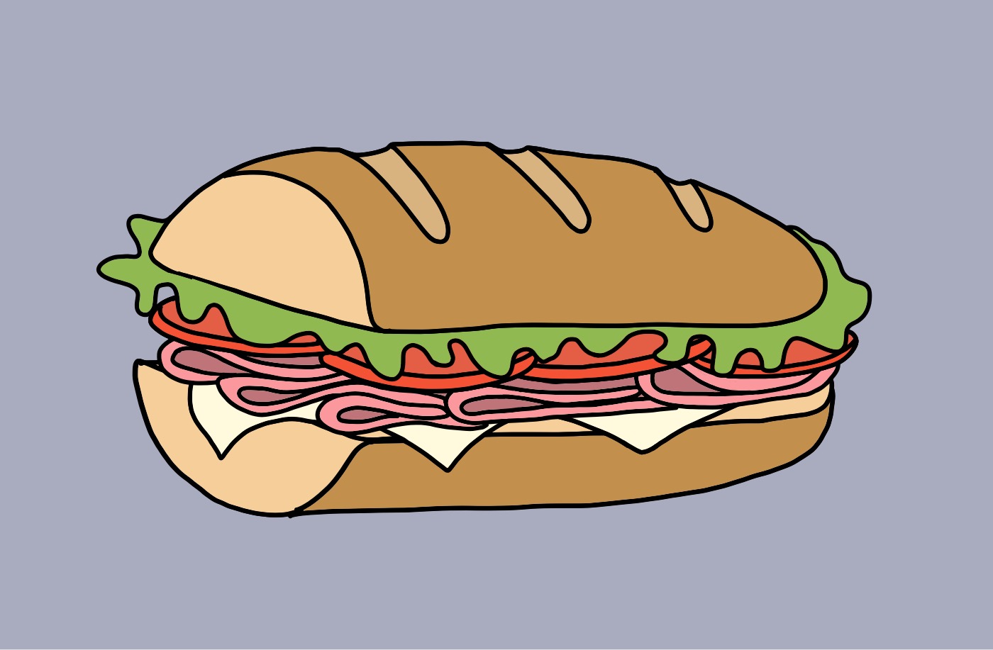
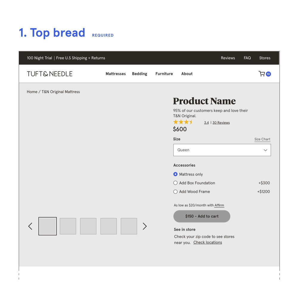
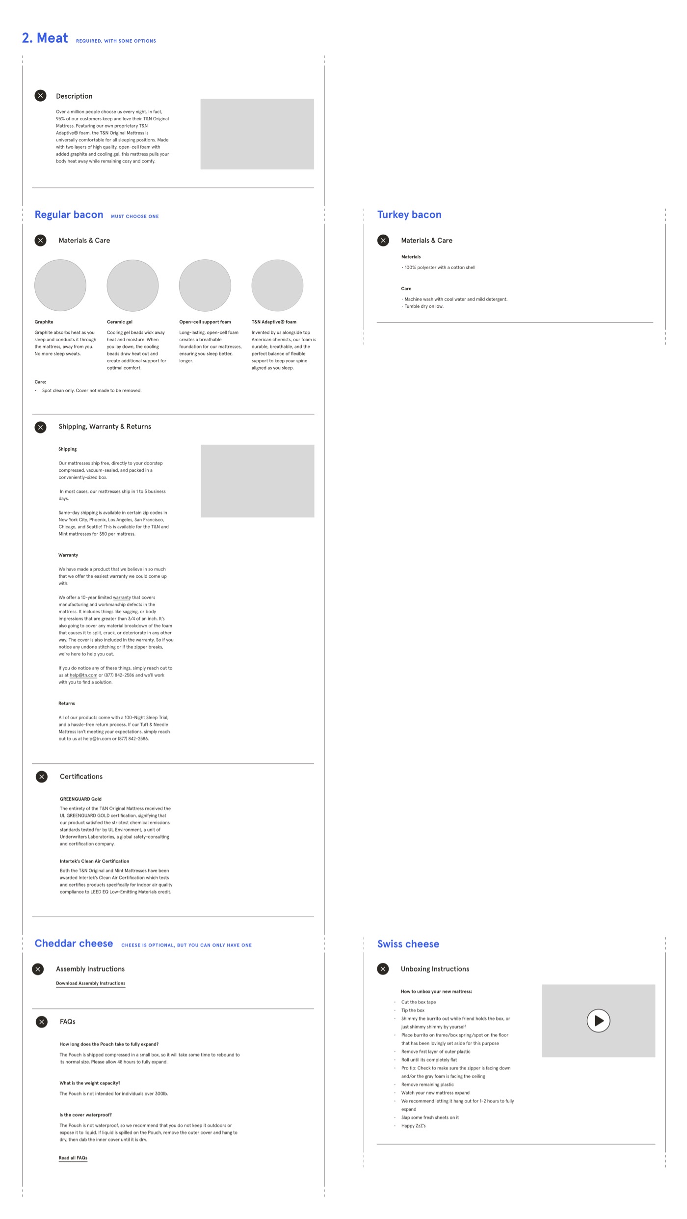
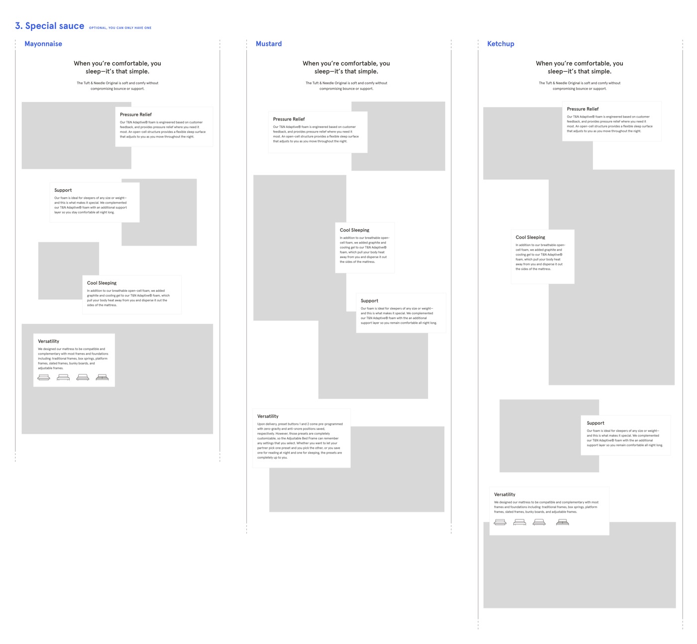
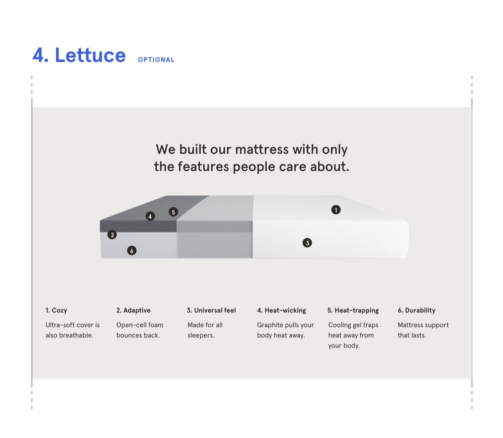
A sandwich model emerges
As we ideated on possible structures for the PDPs, the analogy of building a sandwich started to take shape. Above all, we needed the PDPs to be a balance of flexibility and consistency. We wanted users to always find important information in the same place, but we also wanted to have optional sections to add more rich content to the products that needed it. We realized that just like a sandwich, the PDPs would have components that are always required, like bread and meat. But then there would be optional add-ons — lettuce, tomato, and special sauce — depending on how fancy you wanted to get.
This analogy let us have fun with the project and helped the marketing and engineering teams get on board with the idea.
How it all comes together
At the beginning of each new product launch, we have a multidisciplinary kickoff with product, design, copy, and marketing. Together, we decide the sandwich’s high-level components based on the product’s features, importance, and marketing strategy. Then the designer and copywriter pair to create the page.
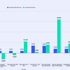
The PDP sandwich template is now fully developed, integrated into our CMS, and rolled out to all product pages. Because of this, we can now launch product pages 80% faster! The consistent template also allows us to rapidly A/B test improvements to the pages. One such optimization — moving the product discovery section higher up on the PDPs — has had a $5,760,000 increase in yearly revenue alone. We’ve also increased one of our most important PDP’s conversion rate by 28.75% and subsequent revenue on that page by 33.22% YOY.
Thank Yous
Rachel Rose UX & Visual Design
Breanne DeMore Copywriting
Dmitry Mardukhayev & Jackson Hardaker Front-End Development
Eliza Marcum Back-End Development
Karla Boedeker Project Management