Tuft & Needle merged with Serta Simmons Bedding in 2018. One of the critical objectives post-merger was relaunching a custom e-commerce site for Serta to increase conversions and allow for future direct-to-consumer growth. The team was given four months to completely overhaul the Serta.com experience.
Choosing a team with complementary strengths
Given the workload and the pace, I chose two designers for the project who would compliment each other’s skillsets. While both had great UX and visual design skills, each had his/her strengths. The timeline dictated that the work needed to be divided, but I established a process of pair-designing whenever possible and several weekly team check-ins to ensure seamless output. The pair functioned exceptionally well together, supporting and gut-checking each other when needed.
The other team challenge was working with the Serta brand team. Steeped in the old traditions of mattress retailers, they considered their primary customers to be their retailers, not the customers using their products. This lead to several fundamental disagreements with the UX of the site that the team navigated with patience and empathy. Trying to shift their mindset to a customer-centric approach was a consistent challenge. However, I’m happy to say that we were able to make substantial headway over the course of this project.
Gaining insights through UX research and site data
Once the team was selected, the first step was analyzing the site and audience data. While Serta had a high volume of direct, unaided search traffic, website sales were disproportionately low.
The team also conducted 15 in-depth user studies on Serta.com. We wanted to understand current site behaviors and gain insights into what information was meaningful and what was superfluous. Our findings included:
- Users were disoriented by the fact that most products were not available to purchase online.
- Users were typically intimidated by the vast number of products; however, the “mattress finder” and comparison functions helped narrow down options.
- Several users had trouble finding critical pieces of information or knowing “where to go next.” A few users noted that the website was “cluttered.”
- Almost all users noted positive or neutral sentiment for the Serta Sheep that have been the brand mascot for 20 years.
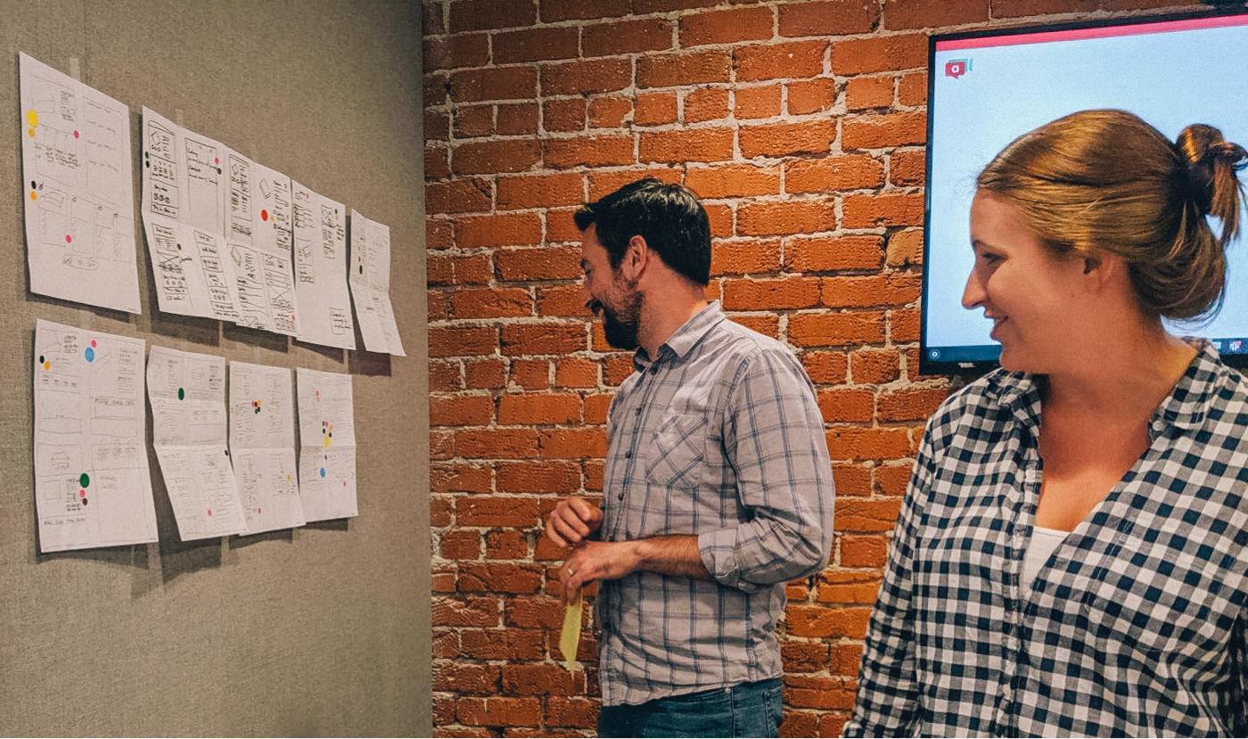
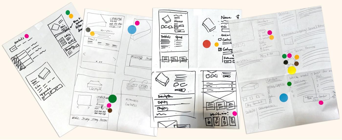
A design sprint to quickly align the team on the core UX of the site
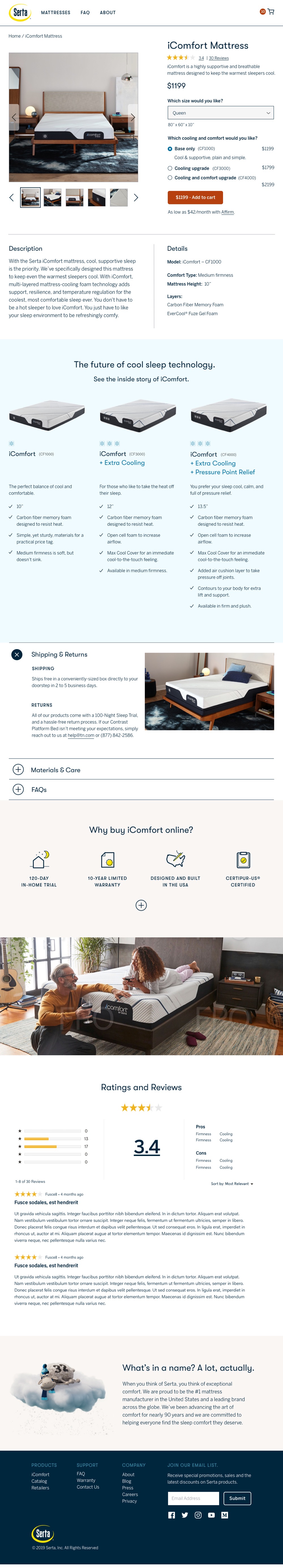
Once the initial research was complete, I lead the team in a 3-day multidisciplinary design sprint. We used our research and empathy-building techniques to keep our customers in mind as we laid out user stories, flows, site architecture, and initial wireframes. The team then fleshed out the initial wires into high fidelity wireframes and comps, getting approvals from the Serta brand team at each phase.
A tailored experience for two very different audiences
Based on our analysis of traffic and user journeys, we hypothesized that the site audience mainly fell into two use cases:
- People in the early stages of mattress shopping: researching and classifying based on price, features, and brand
- People in a retail showroom trying to compare prices before making a purchase
Maximizing timelines & collaboration with an agile workflow
At each phase of the project, design, copy, and engineering collaborated and worked in parallel. Design would hand off pages to engineering in the wireframe stage and then would go back to add refinement with the comps. This created a quick, iterative process that allowed all teams to maximize timelines.
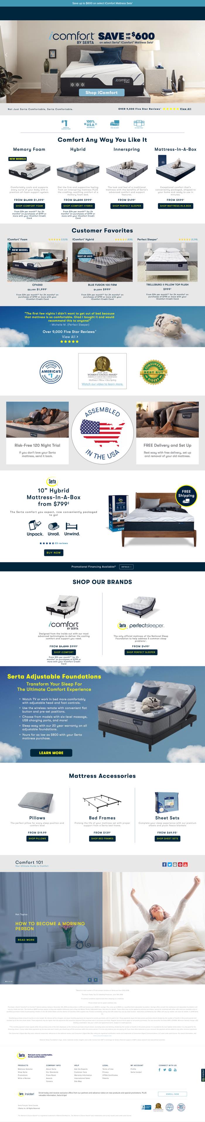
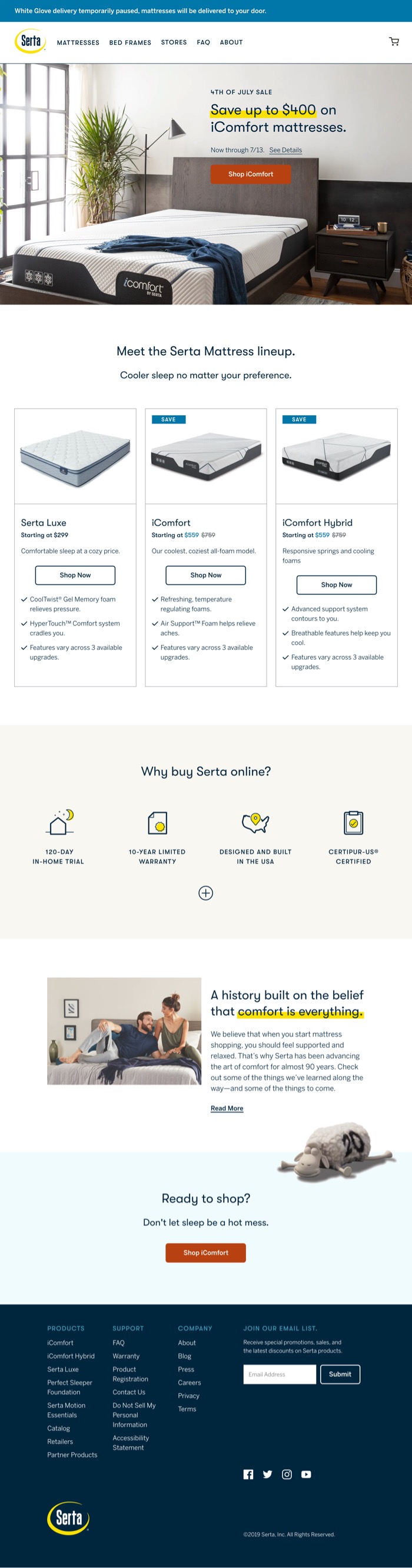
Creating an effective design system
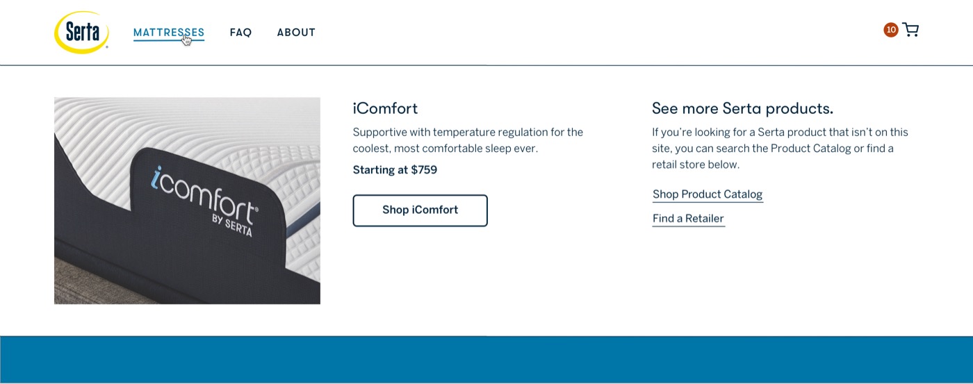
One of the site redesign challenges was creating an effective design system using Serta’s existing brand colors. The blues and yellows were overutilized and mostly not accessible on white. This made finding a noticeable call-to-action (CTA) color challenging. This effect was compounded by the fact that the Serta team had developed an art direction strategy that relied heavily on blue. So our team set out to find a CTA color that would work well with the existing palette and draw users’ eyes toward making a purchase. We settled on a bright terracotta color to complement the existing blues and yellows while standing out nicely on the page.
A new, rolling QA process
We implemented a rolling QA process to help lessen the QA load at the end. Initially, I was a little worried that this would mean double work for the design team. But it ended up keeping the QA load to a consistent, manageable level and allowed the teams to work concurrently and meet the deadline. This will definitely be a process that I use on future projects.
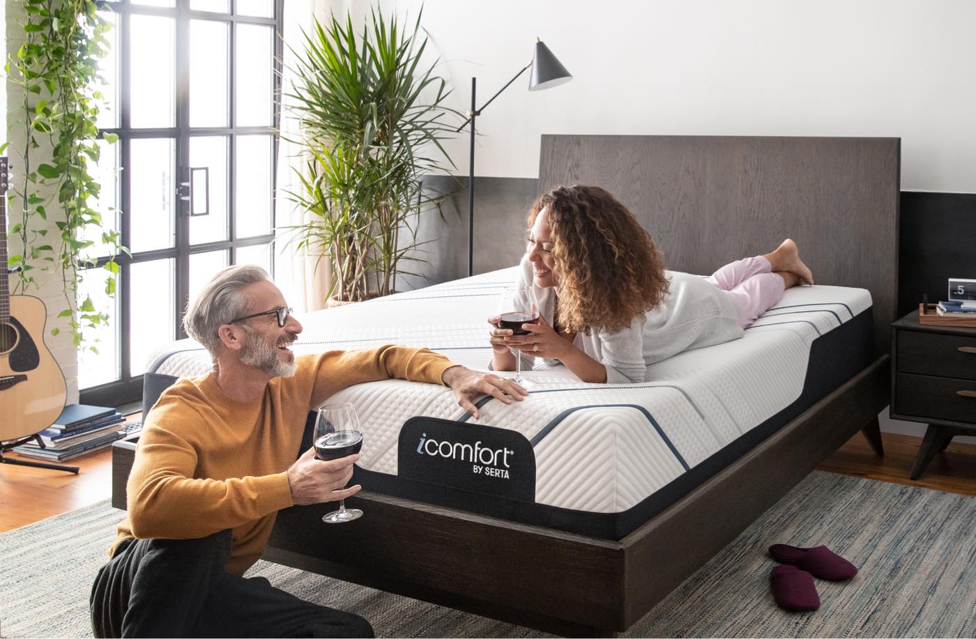
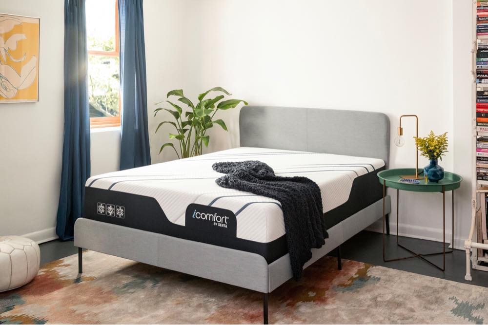
A photoshoot focused on the needs of a modern, responsive website
Serta’s previous photography didn’t take into account things like responsiveness in a website hero. We also felt that the styling, lighting, and talent direction were not in line with the “elevated, high-tech luxury” vibe of the iComfort sub-brand. So while the UX team worked through various use cases, I led the multimedia team in a photoshoot for the website and ad creative. We’re currently testing the impact of the new photos in A/B tests on the site and ads, and early results show success.

The site launched on schedule on December 16. Since then, we’ve seen the conversion rate increase by 116%, which has led to a 48% increase in ecommerce revenue year-over-year.
Thank Yous
Darin Barnes & Rachel Rose UX & Visual Design
Erin Cline & Breanne DeMore Copywriting
Kyle Niemier & Geoff Parker Production & Photo Editing
Colin Darland & Jackson Hardaker Front-End Development
Shay Arnett & Jayson Virissimo Back-End Development
Anna Wolf Photography